A solid website design will bring more traffic to your website with the increase in potential customers and excellent advertising of your business. Living in this digital age where technology and design is on the cutting edge, it is very important to update your content, and sometimes the look/layout of your website.
By providing a reliable and easy source for potential customers to find your business’ services and products, a large positive impact will build your business’ reputation within your community and around the world.
Here are 5 helpful tips when it comes to creating that masterpiece on the web:
1) Use the Right Typography
Choosing the right style and size of font for use on your website doesn’t seem to be a priority; however it can make or break any website. Since most of the website will consist of text of some sort, be it: describing products and services, banners, or information about your company, make sure to pick a font that is legible (including font size), good contrast on the website, and similar to what you’ve already decided upon for your logo.
2) Make Use of White Space
The real estate available for websites gets larger and larger with newer screen resolution technologies. With this in mind, the white space on your website can highlight key elements of each page and showcase content in a “good light”. In a study done by Wichita State University, it was proven that white space improves reading composition. By controlling the flow of content on the website, it will make it much easier for users to locate the desired content without being bombarded by all of the other information available.
3) Get Rid of Clutter
This goes along with making use of white space: de-cluttering your website is also very beneficial. By targeting your pages for certain content, and linking to relative information, this makes it easier to navigation through your website. Pop-up ads, animated ads and buttons can have a heavy load on a website and should be kept to a minimum.
Text paragraphs should also not look like large walls of words on your website. By keeping your information concise and to the point, you increase the efficiency of projecting your content to your users. A good benchmark for paragraphs usually has 4-6 lines.
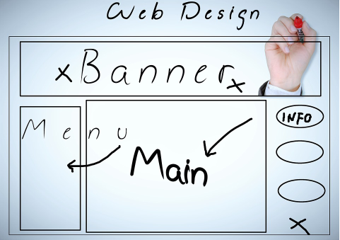
4) Make it Easy to Navigate
Make your website as easy to use as possible! As soon as viewers get confused, they are very likely to leave the page and/or your website itself. Make sure the navigation menu is accessible for both desktop and mobile view, and easy to pace through. Going along with decluttering, a single bar-type hover menu should have no more than 10 major links. A secondary menu, which can feature like a “mega” menu, can have more; just remember to utilize the spacing, typography and design rules for ease of use! Speaking of design…
5) Use Appropriate Colours
Choosing a colour scheme for your website should be based on what your logo utilizes, but also consider what kind of tone or “voice” you want your website to project. For example, a video production or indie gaming company will usually use a dark theme with hints of colour (based on their logo) to give more of a theatrical feel, versus business offices will go for the clean white look to give a more professional attitude to the website.
With these tips in mind, it will be easier for the company to create an effective and user friendly website that not only would it be visually appealing, but help gain more positive attention to your business.
Feel free to Contact Us for more information.